Baltimore Museum of Art Trip
 |
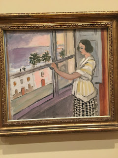
| Henri Matisse Young Woman at the Window, Sunset |
I liked this painting because it seemed very real and sad. I perceived the meaning behind this artwork as a young woman who is stuck on the inside, longing to break out and see the world. Her hand reaching toward the window indicates this. The expression on her face is sadness and loneliness, and I was drawn to this painting the most because of how real her emotions felt. The brush strokes along the painting are soft, and the same goes for the colors used in it. Her eyes are dark not full of life, also showing her longing and depression.
 |
| Piet Mondrian Composition V |
The work of art that I felt deserved ranking number 2 was the one on the right by Piet Mondrian. This piece caught my eye because it was different than all of the other ones I had seen; it has a modern style to it, and shines in its simplicity. The color blocking is a modern style, which is why I was surprised to see it among so many works of art that have a traditional vibe to them. The composition used is L Shapes, and you can see this around the painting. The black lines create L Shapes around the work of art, in all different directions, like if you rotate the painting every way. These L shapes bring your eye to the focal point, which is the blue box on the right, and then they continue down the side of the painting, and across to the small block of yellow color on the bottom left side.
In the Design Wiki, one part really relates to this work of art, it talks about how a line, having length as its property, is a one-dimensional entity. In this painting, the lines overlap and create smaller lines, simply broken up by the original long lines across the canvas. It then talks about how color is optical, meaning it is an innate property of material and therefore something we see regardless of a thing's dimension. The blue in the painting almost seems deeper in the painting, where the yellow seems to sit on top, and seeing it in person really showed this where a picture on the internet could not have.
 |
| Henri Matisse Still Life with Peaches |
I was interested in this painting because of how Matisse was able to make a 2 dimensional painting seem almost 3 dimensional. How he was able to create a table with these objects sitting on top of it is so impressive to me. In the Design Wiki, it talks about how using a mathematical vocabulary of point, line, and plane, the Cartesian coordinate system creates a parallel universe wherein one develops masses and voids, which creates volume. This painting has a lot of volume to it, which creates the sense that they objects on the table are 3 dimensional and it is a scene that you can walk right into. The texture of the peaches and blanket was created using soft brush strokes and warm tones and colors, which is why I was so intrigued by this work of art.


Comments
Post a Comment